In the previous post, we reviewed very basic portfolio reports that can easily generated with initial data. In this post we will continue examining portfolio reports with an emphasis on intermediate level reporting.
Pareto Chart (Financial Contribution)
All companies should have a breakdown of project cost, but not all companies capture project value. For those that do, a Pareto chart ordered by financial contribution (e.g. NPV) provides aggregate portfolio visibility of the most valuable projects. We also find that the 80/20 rule often applies (20% of the projects deliver 80% of the portfolio’s value). This type of Pareto chart provides great visibility of the entire portfolio and highlights how a subset of projects support overall financial contribution. It is a great report for focused discussions regarding how to manage the long tail of low value projects. It is critically important for the portfolio governance team to recognize this tail of projects and how to deal with it. The minimum required data to generate this report is a financial metric (cost, dollar savings, NPV, etc.) and the Project Name or ID.
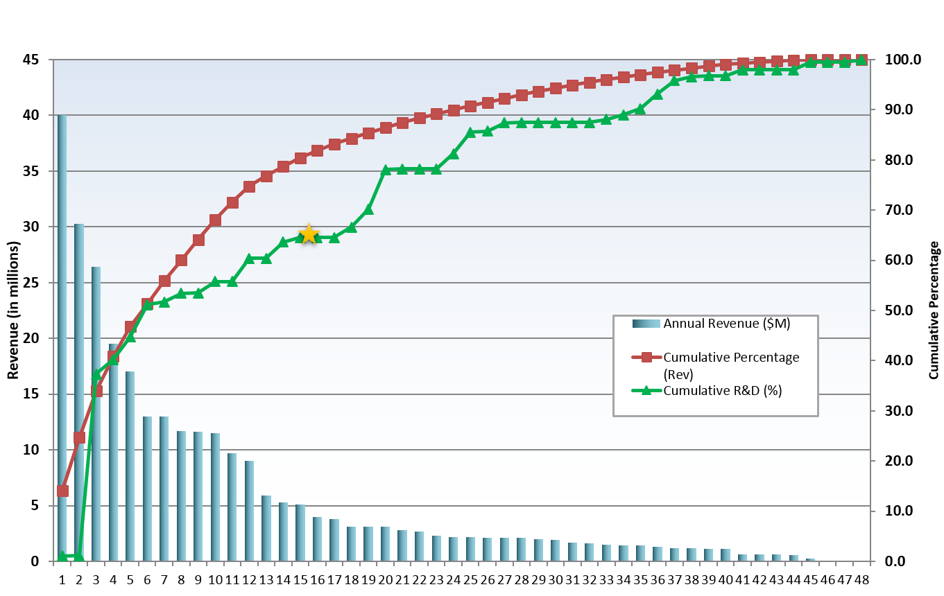
Advanced Pareto Chart
We can take this Pareto chart a step further and overlay additional data points to make it an even more powerful report. In the example below, we have overlaid the cumulative R&D labor (as a percentage of R&D labor across all projects). By adding in this additional resource data, we can clearly see that we can still achieve 80% of the total portfolio value with only 65% of the anticipated R&D spend. In the absence of portfolio optimization, this insight can be valuable when managing bottleneck resources as it points to additional projects that can be accomplished without the use of critical resources. You can substitute R&D for any other role in your company that is a bottleneck to many projects.
These enhanced portfolio reports provide great visibility of the entire portfolio and how a subset of projects support overall financial contribution. It is an even better tool for focused discussions regarding how to manage “the tail”. All you need is the following data: Financial metric (cost, dollar savings, NPV, etc.), project name/ID, Resource data or other categorical measurement.
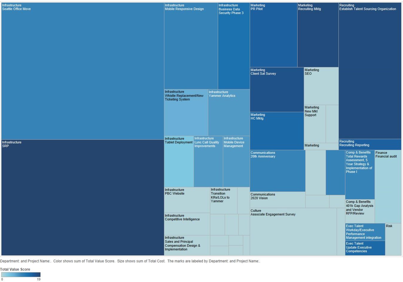
Treemaps
Treemaps offer a graphical alternative to traditional risk-value bubble charts and provides a quick glance of the entire portfolio with categorical information included (e.g. box size = cost, color = project value, grouping by category). The basic information may be similar to traditional bubble charts, but the coloring and sizing can raise awareness of different problems or challenges in the portfolio and is a great report for identifying misaligned projects. I recommend using treemaps in addition to bubble charts (which we will discuss in the next post). Treemaps are common in data visualization software such as Tableau and requires data such as: financial measure (cost, revenue, savings), risk measures (optional), project value (e.g. a value score). Instead of coloring based on value score, you could color based on alignment to particular strategic objectives or by business unit. The example below shows a basic cost/value treemap.
Summary
In this post, we have seen two great intermediate portfolio reports that will enhance governance discussions. These reports help move senior leaders away from a singular project view to an aggregate project view. Even though we adjust individual portfolio components (aka projects), our view is to identify an optimal portfolio.
Are you using advanced Pareto charts and treemaps in your portfolio meetings? Share a comment below.